Jeames font
Download Jeames font
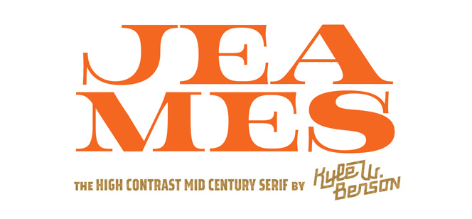
Kyle W. Benson’s font collection is expanding step by step. Apparently he does not hurry at all. What he really does is taking attention to everything – from the concept to the tiniest detail in a rare ligature. I guess this must be part of his character and personality, because everything we have seen from him so far is not just a work, art or concept – it is a statement of knowledge, potential, skills, talent and experience. His latest font is called Jeames and its excellent illustration of everything we’ve said above.
Kyle says this is a mid-century inspired family developed in three separate weights – Light, Normal and Bold. Jeames is intended to be used mostly as a large size display typeface because of its high contrast. Every letter inside the family has its own life, emotions and vibes and those large serifs are the thing that puts the whole typeface into perfect harmony. Though influenced by classic typefaces like Baskerville and Harriet, Jeames’ appearance is very live, vivid and in some aspects even playful. Of course we don’t speak of bouncing letters dominated by a hand-made look – Jeames font is attractive for its playful curves inside every character but it’s also looking tight and balanced because of its skeleton and because of its serifs that nail the whole composition restoring the order and legibility specific for most of the classic serif faces. Speaking about serifs, in Jeames they are simply piece of art – the whole family is very generous in width, letters are wider than usual reminding of large lapidary typefaces and their later brothers of Clarendon-like styles. Serifs are starting nearly from the middle of the stem flowing into very smooth curves and ending with very large foundation. Kyle says this font is designed mostly for display use but imagine this “exception” – a business card designed with Jeames, printed on very thick carton (600 g/m2 at least), letterpress, deepest possible embossing and maybe gilded edges! Well that would surely be a dream-come-true for every designer who loves vintage style, old print methods, sign painting and the touch of a special textured paper. You could also get really mad if you use Jeames for signboards, classic book covers, vehicle branding, wine and food labels, t-shirts, posters and logos. As you see Jeames has so much style and energy that it could easily apply to almost every design. It is also fully OpenType compatible which allows you to get even more of this family if you use the right software and access all those extra features.
We recommend you to get the whole family and explore its full potential by making different combinations with weights and sizes.
Jeames font family is designed by Kyle W. Benson. Follow the links to some of his great fonts and enjoy his professional and artistic work: Good News Sans font, Kansas Casual font, Benson Script font, Maritime Champion font, Millie font.
Supported languages: Albanian, Basque, Belarusian, Bosnian, Breton, Catalan, Croatian, Czech, Danish, Dutch, English, Esperanto, Estonian, Faroese, Finnish, French, Frisian, Galician, German, Hungarian, Icelandic, Italian, Lithuanian, Malagasy, Maltese, Norwegian, Polish, Portuguese, Romanian, Serbian, Slovak, Slovenian, Spanish, Swedish, Turkish, Welsh
Designer: Kyle Benson
Publisher: Kyle Wayne Benson


Submit a Comment