
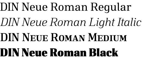
DIN Neue Roman typeface


Download DIN Neue Roman typeface
DIN Neue Roman typeface adds something new to the technical origin of the typeface DIN 1451. The sanserif classic gets a serif counterpart that breaks with convention while preserving its readability. The industrial impression of the static basic principle becomes a little friendlier. Actually, the rigid stroke of a Didone (cf. Bodoni) would be expected here. Instead, the letterforms receive the dynamic stroke of a Transitional (cf. Times). And if relating to DIN a low stroke contrast would seem natural, a much higher contrast is applied here.
Designer Philip Lammert finds great potential in opposites. That led him to this typeface draft that combines two essentially different classics — the DIN 1451 and a serif typeface like Times New Roman. In the design process he has not taken the liberty to loose the concept of DIN. The strength lies precisely in the historical reference and the consistency, with which alleged contradictions are brought together. The result is not an experimental hybrid typeface but suitable for body text. His master thesis Lammert did write on „the hybrid in typeface classification“.
To have enough resources for diverse and complex typography, this typeface family offers seven weights with italics, small caps and many OpenType features. Each font contains over 700 characters.
Designer: Philip Lammert
Publisher: Calligrafiction
Calligrafiction is a type foundry run by Philip Lammert. Read more about Philip Lammert’s debut font Peter. Check also Fontmatters’ selection of the 14 most impressive designers’ debuts on MyFonts – 2014.
DOWNLOAD FONT

New Fonts
Bolyar Sans Pro font family
May 20, 2019 | fontmatters
Download Bolyar Sans Pro font
This is Bolyar Sans Pro font family. It took more than 1 year hard work to transform the existing Bolyar Pro from Serif to Sans Serif version. The result really surprised even us from The … Read More
Attractive font by lettersoup
February 4, 2019 | fontmatters
Buy Attractive font family
Attractive type system comes in 104 styles and 4 widths with extended coverage of the Latin-, Greek- and Cyrillic Script. The design origins of Attractive are in early-20th centuries technical style aesthetics, but they are combined … Read More
DIN Neue Roman typeface
April 6, 2018 | fontmatters
Download DIN Neue Roman typeface
DIN Neue Roman typeface adds something new to the technical origin of the typeface DIN 1451. The sanserif classic gets a serif counterpart that breaks with convention while preserving its readability. The industrial impression of … Read More
Submit a Comment