
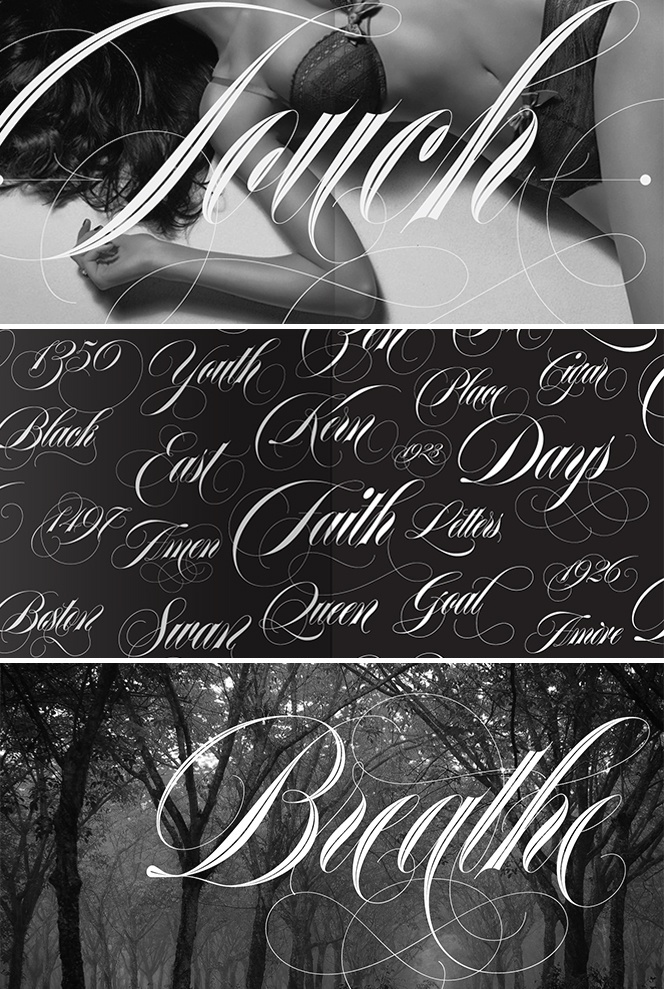
Maximiliano Sproviero Interview – part 1

Fontmatters presents Maximiliano Sproviero and his Lián Types foundry
He’s young, he’s famous, he’s talented and his amazing fonts hit Maxi-million downloads because of their supreme quality, originality and style. Dear friends, meet Maximiliano Sproviero (Lián Types) – one of the most important faces of modern typography across the World.
Max is calligrapher, type designer, an artist who lives in a world between modern and traditional and he benefits from both. He’s passionate, he’s ambitious, he’s an entrepreneur with a heart of an artist and he has created one of the most striking and sophisticated typefaces of XXI century.
This is Max.
Why script – you have so many calligraphic fonts – tell us some more about your affection for this.
Well, I started my love for letters when I discovered the work of Silvia Cordero Vega. A well known calligrapher here in Argentina.
I was only 20 years old then when I attended to a conference in which she made a demonstration of some calligraphic tools. I was speechless. Really surprised with her ‘soul’ traces. At that time, I fell in love with what she called ‘gestural calligraphy’. It was the first time I saw letters made with such a expressiveness and passion.
A new world was now awaiting. I started practicing calligraphy at home, and also attended to some international calligraphy conferences in the States where I met the best in this field.
I am a graphic designer (and love maths), so, although my letters sometimes seem to be really artistic and passionate, they also have very strict rules in order to become Typography.
If you ask me why I prefer script fonts rather than text fonts… I really don’t have a final answer, I think it may change through the years. When I started many years ago, my eye was not very well trained, so I thought many text fonts looked boring or ‘the same’ (and I always wanted to be innovative). But, once you are really in this field you understand that only the tiny details are what make a letter look interesting.
So, now I think that a really well done text font can be as beautiful as a script and it’s in my plans to design one in the future.
Serif, sans or script – where do you see the future of typography?
Tough one, really. And I have different answers depending on what one understands and wants to do with Type.
a) As regards the immediate future of typography in the streets, I don’t see (well done) scripts. People are starting to forget about the beauty of calligraphy and its tools, and as a result, we see very poorly done fonts.
To be honest, I don’t like the present we are facing in this field. Trends are ‘harming’ typography because they’re making it volatile. And to me, Typography is something that must remain forever, which lead us to:
b) The future of Typography as a ‘product’ that we, the designers, want to improve, is good.
For example, all Latin America is intensifying the study of it with the creation of postgraduate courses (some years ago Universidad de Buenos Aires in Argentina opened one, with amazing results), and more and more workshops. Also, thanks to social networks, knowledge is being ‘delivered’ to everyone like never seen before.
The interest of students between sans, serif, and scripts is more or less even. And I believe it is still possible to design new functional fonts with that innovative condiment which is always sought.

Rules or freestyle? Where are you in – precision, order and alignment or expressive gestures, randomness and improvisation?
“Know the rules very well, then break them”. You can’t be a type-designer if you don’t follow several strict rules. Making a script font is a challenge. Like I usually say, -it is not the easiest style to do in typography, as some may think- The problem is that many designers make scripts without having enough knowledge.
It is true that when I practice calligraphy, ’randomness’ leads. I try being very expressive and let my whole arm flow. But once I see potential in a particular word or letter, I take it to the computer and a new kind of challenge begins. And this is, how to follow Typography rules without losing the passion and expressiveness of the inked letter.
I think the solution is to equalize. It is necessary to find out exactly which of all those ‘awesome’ details in your written letter you keep and which ones you discard.
In my opinion, Calligraphy is a kind of art. A way to express yourself with total freedom. In Type, this freedom has to be reduced in order to achieve a well-done end product.

Weapon of choice – show us your arsenal and which tool you like the most.
I have lots of weapons. All kinds of nibs, brushes, markers and pens. I choose my tool depending on my humor. However, I think that the pointed brush is my favorite. I love its texture! I usually play with the Pentel pointed brush when I have nothing to do. I write random words or sometimes, the lyrics of the music I’m listening to in that moment.

Paper or monitor – digital or traditional? What is your approach while creating fonts?
Like I said above, it sometimes starts with random words I write on paper. To be honest, I enjoy that part way more than the digital part. But, both have advantages and disadvantages. It is very easy to make related letters in digital while on paper it demands more time. I sometimes use tracing papers if I’m working with a pencil, but I prefer the mask in Fontlab.
Some fonts of mine require perfectly shaped curves, so this is way easier if you work with Beziers.
I’ve got a really big L-desk: When I’m tired of calligraphy I turn my seat to the computer, and when I’m tired of rules of Typography I go back to the paper and play. That’s my life. Haha!

Webfont or desktop font?
What is the trend and what do you feel is the most important – how you see a typeface printed on paper or displayed on your cell phone or tablet?
I prefer, by far, printed typefaces. I don’t like the distance there’s between the user and the screen. Fonts feel more real on paper.
The truth is that I am not really into web fonts because that world still needs to grow a little bit: Not all open-type features are supported yet, so I think that my fonts cannot be really appreciated when used in web.

to be continued …
Maximiliano Sproviero on Lián Types, Facebook, Twitter, Flickr, MyFonts.
Photos by Eli Higa.
Fontmatters, ©2014


New Fonts
Bolyar Sans Pro font family
May 20, 2019 | fontmatters
Download Bolyar Sans Pro font
This is Bolyar Sans Pro font family. It took more than 1 year hard work to transform the existing Bolyar Pro from Serif to Sans Serif version. The result really surprised even us from The … Read More
Attractive font by lettersoup
February 4, 2019 | fontmatters
Buy Attractive font family
Attractive type system comes in 104 styles and 4 widths with extended coverage of the Latin-, Greek- and Cyrillic Script. The design origins of Attractive are in early-20th centuries technical style aesthetics, but they are combined … Read More
DIN Neue Roman typeface
April 6, 2018 | fontmatters
Download DIN Neue Roman typeface
DIN Neue Roman typeface adds something new to the technical origin of the typeface DIN 1451. The sanserif classic gets a serif counterpart that breaks with convention while preserving its readability. The industrial impression of … Read More
Submit a Comment