
Resistenza Interview

Fontmatters presents Giuseppe Salerno and Paco González from Resistenza
Resistenza type foundry (Giuseppe Salerno & Paco González) is tonight’s star of Fontmatters. This interview is dedicated to one of the most expressive and attractive modern type foundry – Resistenza.es. Life, work, talent, skills, dedication and devotion – everything gathered in one place and focused in one single goal – creating amazing unique fonts. This is the short story behind this small but very perspective and prosperous team – the long one is about hard work, lots of traveling, creativity and of course – lots of amazing typefaces.
Giuseppe Salerno & Paco González of Resistenza – an interview by Fontmatters. Enjoy Reading!
Giuseppe and Paco, you often travel across Europe and Americas. Can you tell us a little more about people’s affiliation to calligraphy lettering and letters in general in different countries?
During our trips we do not meet easily, letterers, calligraphers in every place, through unless you are not in Type-related events, we always try to get it touch via social medias, but honestly you do not meet calligraphers on the next corner of the streets.
We were in Fairhaven a small village close to Seattle and we met a letterpress shop very close to our flat, was very surprising. So, you never know, typophiles are everywhere!
Letters are the key of communication, so everywhere there is a heritage of letters and you can find it in many ways… walking the streets, browsing in antique book shops, visiting a museum, giving or taking a workshop, even having a cup of coffee… In a global world you can still find local letter works, many of them with an old tradition and special flavour.
Paco and I had this awesome experience in the States, but we are more often in Europe. During our trips we are always looking for interesting type related places and to know more about history and culture. By the way during our last trip to USA we had the chance to see awesome sign painting in San Francisco and visiting the Neon Museum in Las Vegas, which is a must see.

But there is still a lot to travel and we would love to get to know all the Mediterranean countries, for their pasts, knowledge, heritage and of course for the great food and wines.
In 2013 we were in Berlin, was definitely one of the best places to be if you want to dedicate your life into type related career. We had the chance to meet some of the most representative typophiles and refresh our type-education. Giving workshops all over Europe helps you get new vibes, ideas, friends and traveling makes you wiser.
Last year we met Typedepot in Sofia and they kindly took us to Plovdiv which is an awesome spot, we visited a museum with old Greek, Latin, Cyrillic and Armenian calligraphic manuscripts, in the same room!
In Italy new events are happening right now, in Torino we recently meet some awesome guys from Archivio Tipografico and we are working on a new Nautica poster with them. Stay tuned!

Is it correct to say that at present days the best script fonts are made in Latin America while Europe remains the best place for modern sans and serif fonts?
Isn’t it too general talking about continents? Some countries from Latin America like Argentina, Uruguay and Chile are definitely dominating the market with their script typefaces. Germany, Holland and Eastern Europe are probably more developed into text typefaces? But nowadays is hard to make a relation with new type designers and their countries, there is a big geographic change in the typographic market, is not dominated anymore by Europe and North America. South America is rised up in the latest years, in their new typefaces you can feel the tradition and the romanticism. Europe is more related to text faces, but is not 100% true, we are living a calligraphy and hand lettering revival, some type designers are working on high quality script fonts, bringing a new air to this scenario.
Giuseppe, you are born in Italy – your country and culture has amazing constant contribution to modern visual arts, architecture, graphic design and typography from the time of Roman Empire, thru the Renaissance till present time. Do you benefit from the fact that you actually live in such environment and you could easily “touch” all these achievements of your culture?
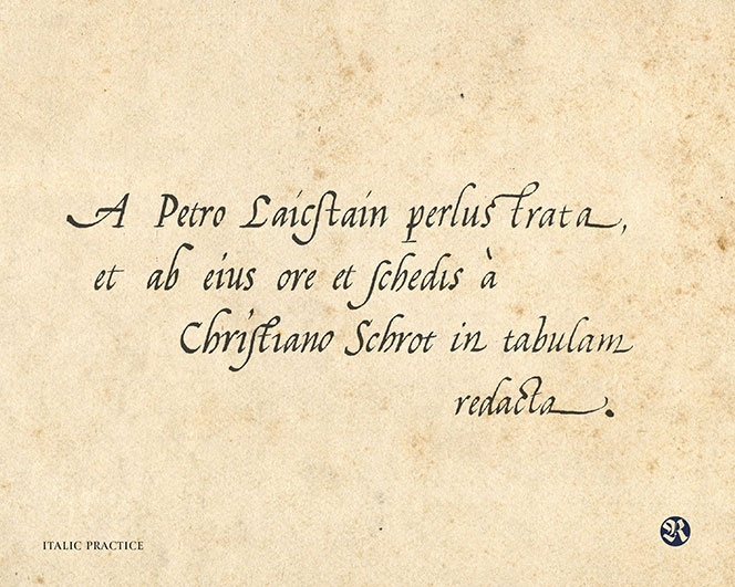
I think I can catch this Italian touch because I spent most of time out of Italy, especially in Spain. Coming back is always refreshing and makes you think how valuable and awesome is our Italian heritage. The Italian futurism is one of the period that inspires me the most, Marinetti, Balla and Boccioni were able to add a great revolution to visual arts, writing and the use of typography, specially on poetry, representing how onomatopoeic sound should be visualized, this was out of mind. I studied calligraphy when I was young and was easy to follow calligraphy classes in Italy, is definitely a country to visit and get inspired by.
How does this influence your work and your inspiration?
At the moment I’m studying renaissances maps and I discovered Abraham Ortelius which is a Flemish cartographer, illustrator and calligrapher, and also Jacobo Castaldo other amazing one from the same region where I’m from.
It’s evident you have very successful team work with Paco Gonzalez. Tell us some more about it – is it difficult when you’re not sharing same office?
We do share offices most of the time! We share desk, houses and laundries! We live, work and travel together.
When we take a look at your portfolio we see great diversity – almost every new entry is completely different from the previous. How do you switch from one style to another? Is this done on purpose or you just get a different inspiration every time you start a new font?
We believe that working on a diverse catalog of typefaces is our strength, our aim is to achieve a list of typefaces that can work very well together, with strong and different personalities, easy to recognise. We are the first Italian/Spanish type foundry with so many script faces and we want to focus on display and handwritten fonts. The experience of calligraphy and the practice with new tools bring new fresh air to our types. And yes the idea to switch from one style to another is on purpose, creating surprises give us more attention, you won’t see an already seen type on our catalog.
Our creative process changes a lot from one to another project. Sometimes ideas come out in a sketch book, other times just reading a nice handwritten chalkboard on a beautiful café. We are passionate about what we do so our minds are always open wide to letters in all their forms.

What is your favorite typeface from your portfolio? Is there any surprising story or special making process like it was with Two Fingers behind your fonts – something interesting from the kitchen that you’d like to share with our audience?
Paco: Nautica was a very extended project, tracing and capture Giuseppe’s copperplate hand into a digital font was an hard task. At the same time adding curly swashes OpenType features and 900 glyphs. Now we are designing Greek version, hopefully if some Greek type designer is interested in helping us with would be awesome (contact us at info@resistenza.es).
What’s fresh right now in our kitchen is ‘Vernice’, a family inspired by American sign painting composed by brushy casual caps and a smooth brush script with a lot of freshness and ligatures.

Tell us more about the beautiful Mina and Mina Chic.
Mina was the first type family designed as a Open path and is one of our bestsellers. Its aesthetic we consider was understood and people loved it. We wanted to design a mono-linear script with long connections and adding some Spencerian influences, the result was Mina.
Drawing that on Glyphs was very inspiring and we discover a new workflow. Afterwards we developed other typefaces with the same technique, like Rachele and Quaderno.
Mina Chic is a development of Mina, we used the same skeleton, but we added more expansion on the strokes and corrected some shapes, adding a more human calligraphic look, keeping the expressive side of Mina.
Is designed on Glyphs, our favorite app, actually they just released a new Glyphs 2.

What’s the story behind your wonderful ‘Lettering VS Calligraphy’ project which you do together with Martina Flor?
When Lettering vs Calligraphy began Paco and I were in Berlin, was a long wintertime and we had the chance to meet Martina at the Typostammtisch an awesome typetalk in Berlin.
We shared the same passion about designing, writing and producing letterforms, so the idea was to create a dialog between a calligrapher and a letterer and create a library of new letters. Paco was adding ideas, working on the social media side and moderating some battles, our formula worked, we created a large amount of letters and all of them were following a certain concept.
This adventure aims to explore the capabilities of the two technical approaches. It delivers one letter daily and takes place online, where the visitors are invited to vote for their favourite.
This was challenging. We also set up an exhibition at MotaItalic, give a speech at TypoBerlin 2013 and produced some prints. It was an exciting period, people were very supportive and receptive with our projects. The result was magic, thanks to ‘Lettering vs Calligraphy’ we designed new typefaces, Martina got inspiration for her lettering, so our website became a free open library of ideas. Was WOW!
Today we see a great competition between small and big foundries and single artists. What is the formula of creating a bestselling font?
Originality and beauty doesn’t always make your font a bestseller, we think it has to gather other different requirements like usability, quality, flexibility and of course is always good to follow and identify the trends.
Promotion is other important ingredient of this formula and for small foundries like Resistenza always an obstacle to deal with, but we get to spread our work thanks to social media.
Unique typeface, abundance of alternates, multiple weights and styles, web compatibility – which one of these works best or we’re all wrong and putting 90% discount solves all questions?
Creating a typeface is a long and delicate work, so we personally don’t believe on this discount strategy. Of course we also offer temporally discounts and promotions, but in our opinion a very high one only devalues your work. There’s a big effort after every typeface and these 39$ many times are the best investment for your project; is not much money and it worth it.
By the way, graphic designers, type designers and the editorial designers need a new solution instead of the classic method that we use right now. It’s a shame that this kind of topic are not usually spoken during type-conferences etc… for some reason few people talk about it when it should be an open conversation.

Do you believe that every font matters?
Yes we think so, every font can solve your design layout in some aspects, for some special communication. In this case we do not talk about beauty or perfection but more about following the right concepts at the right moment with the right font. Some typefaces are more versatile than others, original display font cannot be used everywhere but they add your layout some flavour that is what you were looking for. Being original doesn’t mean be usable.
www.resistenza.es
twitter: Giuseppe Salerno & Paco González
tumblr: www.calligraphyinberlin.com
Resistenza Interview
Fontmatters, ©2015
Tags
interview

New Fonts
Bolyar Sans Pro font family
May 20, 2019 | fontmatters
Download Bolyar Sans Pro font
This is Bolyar Sans Pro font family. It took more than 1 year hard work to transform the existing Bolyar Pro from Serif to Sans Serif version. The result really surprised even us from The … Read More
Attractive font by lettersoup
February 4, 2019 | fontmatters
Buy Attractive font family
Attractive type system comes in 104 styles and 4 widths with extended coverage of the Latin-, Greek- and Cyrillic Script. The design origins of Attractive are in early-20th centuries technical style aesthetics, but they are combined … Read More
DIN Neue Roman typeface
April 6, 2018 | fontmatters
Download DIN Neue Roman typeface
DIN Neue Roman typeface adds something new to the technical origin of the typeface DIN 1451. The sanserif classic gets a serif counterpart that breaks with convention while preserving its readability. The industrial impression of … Read More
Submit a Comment