
Olivier Gourvat Interview
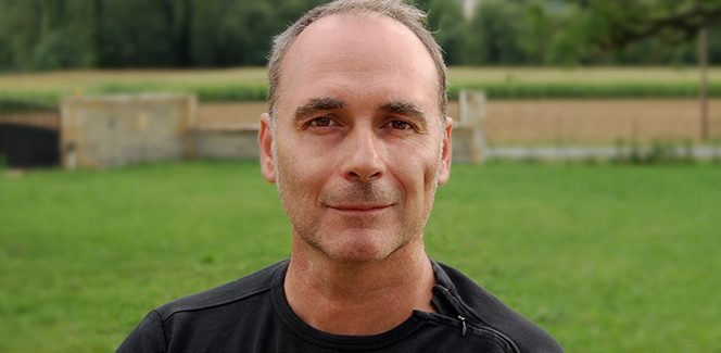
Olivier Gourvat Interview – typography inspired by the rhythm of the drums
Our next interview gets us in Southern France. We will meet a drummer that has just realized his latest project. And we are not joking. This is Olivier Gourvat – one of the most modern French font designers and the founder of the Mostardesign studio. Olivier is a multi talented artist that excells not only in the field of type design, but also in brand creation, illustration, custom type and advertising. Please, play some rock music and enjoy the interview.
Where did your interest in typography and lettering come from?
I was immersed in typography from a very young age! My father and my grandfather, were sign writers and had their studio not far from our house. They painted billboards and signs entirely by hand for major French brands. When I went into this workshop, I saw all these huge painted letters and I found it really incredible! I said to myself: “How can I do this by hand with a simple brush?”.
And then, the house’s library was full of books by Cassandre, Deberny, Peignot and more contemporary catalogs like the Letraset or Mecanorma catalogs… With all this, I could hardly escape becoming a designer!
As I grew up, I also began to draw letters, logos and I quickly liked this job. I then commenced studies as a graphic artist-illustrator where I learned to create and execute letters with a compass, drawing pen and Indian ink. In short, I would say it’s a family story!
Why Mostardesign?
It was after a trip to Prague that I began to take an interest in the culture of Eastern countries. I read the very touching story of the Bosnian city of Mostar, which at the end of the war, underwent the reunification of West Mostar (Croatians and Catholics) and East Mostar (Bosnians and Muslims) thanks to the reconstruction of the Old Bridge “the Stari Most”. I found the symbolism very moving and that is why I chose this name, based upon the tangible and intangible reconstruction of human peace.
And then I liked the name because it also sounded a bit like the title of one of my favourite Carcass songs… “Blackstar”. I then added the term “Design” in order to stay in keeping with the graphic design and drawing world. For me, this name represents a little of all the things I love: graphics, heavy metal music and geography.
Is there something different in your new project and what features make it unique?
Rival Sans is a variation of the serif style that I published a few months ago. I found it interesting to create this variation in order to have a truly integrated “super” font both in terms of style and with respect to OpenType functionality. The first specificity is the finishing of the diagonal barrels of certain typefaces such as the X, Y, or K which are skewed at their ends. This brings more balance to the “Full” nature of these typefaces and broadens glyph width more consistently with the rest of the letters of the alphabet. The second particularity of Rival Sans and a “stylistic alternate set” with the letters, a, g, l, y and two different Qs to vary titles and large headlines. With respect to numbers, the set is quite integrated as there are some old-style figures that are really coupled to lowercase letters, tabular figures, circled figures, barred zeros…

Rival Sans – sketches (up) and stylistic alternates (down)

The other feature of Rival Sans is that is has a “true” Italian style, which like Rival Serif, was really designed to highlight italicised texts. This new font has more than fifteen OpenType features in order to meet the requirements of professionals who want a truly complete font that matches the new uses of typography such as on websites, mobile applications and online editorial content, etc.
You have created many sophisticated and complex font families and most of them feature full width range including italics and an abundance of ОpenТype extras. Is this the best professional solution for you that will offer designers great freedom, inspiration and diversity in their work?
Yes! In my opinion, offering a rich diversity of thicknesses and functionalities to designers is a good solution in order that users have a maximum freedom of creation in their work. I’ve been a graphic designer for a long time and I know the importance of typography in the creative graphic design process. When I create a new family of typefaces, I try to put myself in a creative’s mind and I often test the different thicknesses in order to know which ones will be the most practical. This testing is very important for me because it allows me to find the right interpolation formula to obtain a set of practical and mostly non-linear thicknesses.
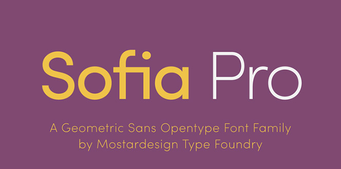
Sofia Pro font family
Sofia and Filson are your most popular fonts. But is there a font that is more important to you or one that you love more than the others?
Yes, it is true that it is two fonts have had a remarkable success and I thank all the designers who use these fonts regularly for their projects. Sofia Pro is a font that I also like a lot but through having working on it so much, I ended up getting a bit sick of it! I still have a slight preference for Filson Soft! I find that this font brings freshness to the category of ‘geometric sans’ with very rounded and friendly features. It was a font that I spent a lot of time on; I did a lot of sketches and drafts before moving on to the completion and finalisation stage.
When it was released in 2016, I was quite disappointed because this font had not been as successful as I’d expected; I had put a lot into it and it was really very disappointing. But today, the feedback from users is really positive and I am very pleased.
 Filson Soft font family
Webfont or desktop font? What is the trend and what do you feel is the most important – how you see a typeface printed on paper or displayed on your cell phone or tablet?
The current trend is clearly digital fonts and I think that will be the case for a while! Today, our daily lives are conditioned by the use of applications on our phones and through going online on to websites on our tablets and it has become really essential that fonts are optimised for digital displays! As opposed to paper, I find that digital media give energy to the characters thanks to the possibilities for interaction that are offered today. And then with the arrival of “variable fonts”, I think that the quality of display fonts will improve even further, and I find it rather good as the arrival of new technologies stimulates the type-design profession, which needs it.
Afterwards, it is true that the perception of typefaces is completely different depending on whether one is viewing them on an electronic medium or on a physical medium (such as paper, for example). I always had a slight preference for paper as a medium, that sublimates typography through the printed medium and this is still the most comfortable way to read long texts. I find that digital media is better suited for disseminating visual communication with much shorter texts.
You have been in the profession for a long time. Do you notice any difference in the demand for fonts between 10 years ago and now?
When I started working in typographic creation, demand was not as strong as it is today and fonts played only a secondary role in companies’ overall communication strategies. Today, demand has evolved considerably and now a company’s visual identity must use a specific font in order that a brand or company can be better identified; It is as if typography now plays a role of identification in modern communication.
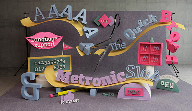
Still life image to promote the launch of Metronic Slab Pro. Read more on Behance
Typography now has a very important power and force and is capable of conveying values and emotions depending on whether you choose this or that font. Finding the right balance between the strength of the image and the aesthetics of the characters has become a major challenge for a company’s effective communication strategies.
The other big change was also the use of fonts for the internet, mobile terminals and apps. Demand is constantly increasing and has completely turned typographic demand upside down with there now being a strong demand for new fonts.
Please, tell us more about the symbiosis between the drums and the typography (Olivier is the drummer and co-founder of the heavy metal band Sonoloco). How do you combine them?
Playing the drums is my other passion! I have been playing the drums for more than 20 years now. I started out messing around with buddies when I was a teenager and I never stopped! It is really something that I love as it completely takes me out of my type design universe where one must be studious, precise and meticulous. Playing drums and heavy metal is completely different! I can completely let go, play the music that I love, and be around friends to discuss whatever comes into my head.
We are not a professional band but we try to do it seriously all the same! Music is an activity that I practice in my free time and I manage to combine this quite easily with weekly rehearsals and as requests for us to play concerts and festivals come in.
If you want to know more about my band, do not hesitate to take a look at our youtube channel or on our record label and listen to our latest album “Dangerosa”.
Does one of those two bring you more pleasure than the other?
It is always difficult to compare these two activities in order to know which one gives me the most pleasure. I confess that I’ve really never thought about it! I would say that each of these “pleasures” is completely different. On the one hand, I love my job as a designer where I’m allowed to thoroughly indulge my creative side and my passion for drawing that has never left me. On the other hand, I love to meet up with the friends I have known for a long time and play music together. And then, performing in concert and always a truly special pleasure and which elicits such powerful emotions when we play on stage… So, it’s impossible for me to choose between each of my passions!

Olivier Gourvat on the drums
John Bonham, Chad Smith, Brendan Canty, Nicko McBrain or… Which drummer influenced your development as a musician most?
Wow! Only really famous drummers!! I find them impressive and I would like to have their skill:-). They are truly immense artists and beasts of the stage! There is also a John Bonham solo on YouTube which is really incredible! After that, what I admire most about professional drummers is not necessarily their technique, but rather their creativity and their ability to invent a game that is all their own. I’m a fan of Lars Ulrich (the drummer for Metallica) who influenced me a lot. This guy always finds incredible riffs and sequences to boost the songs! I also love the drummer from Gojira, Mario Duplantier. He is also from my region! He really has a style that I like a lot too… A very precise, powerful and very creative style. In addition to his career as a drummer, Mario Duplantier is also a professional artist. He paints and draws on snare and bass drum heads. A true artist… I love that!
Do you believe that every font matters?
Yes, more than ever! They are all important as each font represents the soul of its creator. We see it a lot lately with all of these fonts inspired by handwriting that have sprouted up everywhere on the internet. These fonts, more than ever before, are a reflection of the expectations of our time! We need more and more of a human and natural “footprint” in a world that is becoming more and more digitised and standardised.
I find that all these script fonts are important because they offer a vast range of styles and it’s really great for graphic designers! And then, writing helped the world evolve and will continue to help it evolve. Let us not forget that!
Olivier Gourvat interview
Fontmatters, ©2017
Tags
interview


New Fonts
Bolyar Sans Pro font family
May 20, 2019 | fontmatters
Download Bolyar Sans Pro font
This is Bolyar Sans Pro font family. It took more than 1 year hard work to transform the existing Bolyar Pro from Serif to Sans Serif version. The result really surprised even us from The … Read More
Attractive font by lettersoup
February 4, 2019 | fontmatters
Buy Attractive font family
Attractive type system comes in 104 styles and 4 widths with extended coverage of the Latin-, Greek- and Cyrillic Script. The design origins of Attractive are in early-20th centuries technical style aesthetics, but they are combined … Read More
DIN Neue Roman typeface
April 6, 2018 | fontmatters
Download DIN Neue Roman typeface
DIN Neue Roman typeface adds something new to the technical origin of the typeface DIN 1451. The sanserif classic gets a serif counterpart that breaks with convention while preserving its readability. The industrial impression of … Read More
Submit a Comment