
Stephen Rapp Interview


Stephen Rapp Interview by Charles Borges de Oliveira
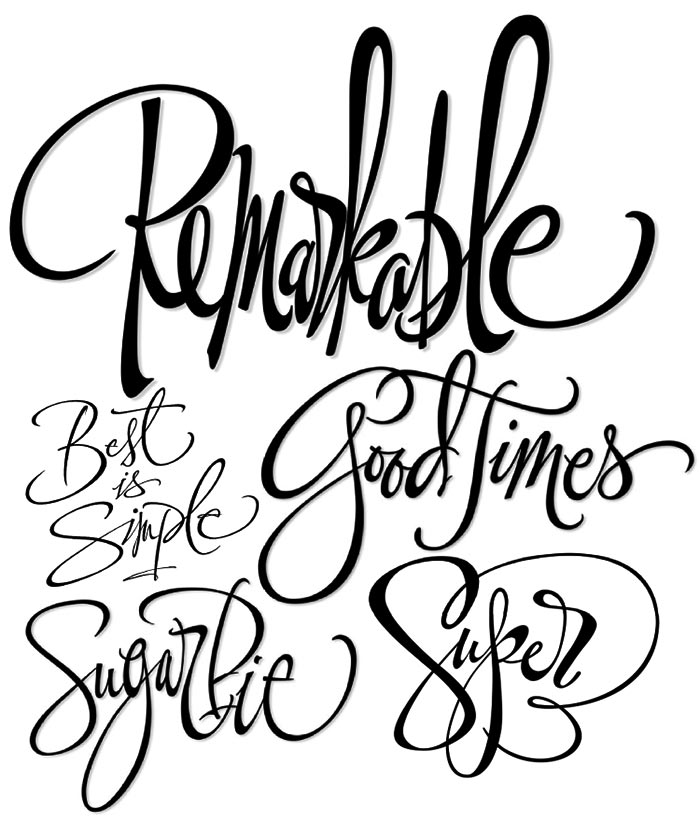
There is no doubt that our dedicated audience knows Stephen Rapp (stephenrapp.com) and his remarkable work very well. But how many of you know what’s really happening inside his Lettering Kitchen? Read more about how a draft sketch becomes a best selling font in Fontmatters hot new Christmas Interview with Stephen Rapp interviewed by another great star in modern Typography – Charles Borges de Oliveira (www.borgeslettering.com).
Stephen Rapp began studying calligraphy and lettering in the late 1980’s. In 1997 he was a recipient of the Hermann Zapf Scholarship Award and shortly after became a lettering artist for Current Greetings. In the summer of 2000 Stephen moved to Ohio to work as a lettering artist and type designer for American Greetings and in 2010 left to start his own studio. Stephen’s work has been exhibited in a variety of publications including Letter Arts Review, Bound & Lettered, Scripsit, Modern Mark Making, Communication Arts, and Hand 2 Type.
He teaches classes and workshops on calligraphy and lettering and has served as faculty member for both International Lettering Arts Conferences and Typecon. In addition to his lettering and calligraphy work, Stephen designs commercially available fonts. His type designs have garnered numerous awards including: Typographica’s “Best of 2008”; Type Directors Club “Excellence in Type Design Award” for 2009; and most recently inclusion in Communication Arts Typography Annual2. In addition to commercial fonts and lettering, Stephen also does a great deal of custom font design.

Charles Borges de Oliveira: How did you get into lettering and also font design?
Stephen Rapp: I’ve seen a lot of artist interviews that start with this. It’s usually followed by citing memories of drawing or painting from early childhood. Having grown up in Indiana in the 1950’s, art was not considered of great importance and certainly not a career choice. So I was not exposed to art at an early age. I think I was 36 when I finally decided I needed to find a career. I started attending a community college and took as many art classes as I could. During that period I happened upon a calligraphy exhibit and later contacted one of the artist and began studying calligraphy.
Fast forward a few years and I was at a weeklong calligraphy workshop at Camp Cheerio in North Carolina. It was there that I was recruited to work at Current Greetings in Colorado. My time there was pretty short due to the company being sold, but it did afford me some valuable experience. From there I moved back to Massachusetts and house painting while trying to scare up some freelance work wherever I could. I managed to land a few jobs from Gibson Cards and Marcel Schurman and sent samples to American Greetings. A few months later I got a call from American Greetings offering me 2 freelance jobs and asking if I was interested in a full-time job there. Being dirt poor the answer was pretty easy.
I remember during my interview I asked about the possibility of designing fonts. I was told all that was handled by one person and I only needed to send him my alphabet. I knew I wanted to be more involved in the process so after my first year I convinced upper management to let me try digitizing my own work. Before I knew what was happening most of the lettering artists were asking me to digitize their fonts as well. I also started designing commercial fonts around that time and have never looked back.
CBdO: What were some of your earlier influences?
SR: My passion for calligraphy was my most obvious influence. It opened my eyes to both lettering and typography as well as just the sheer purity of form. Finding inspiration is easy once you’ve developed a passion for something. I do remember roaming the greeting card aisles buying cards just as lettering inspiration in my early days. Although I now work with all sorts of letterforms, it’s still hard to completely hide my calligraphic training.
CBdO: How long does it usually take you make a typeface?
SR: In my case, that’s a difficult question to answer for a few reasons. Designing fonts has never been an exclusive job for me. Even though I left American Greetings a few years back I hold a contract to digitize all of their proprietary font designs. As we speak I also have 3 lettering jobs, 2 workshops to plan, and some private client font work. So my time for personal font work is very divided and hard to calculate. At any given time I usually have several fonts in various stages of development going. This is not an ideal way to work so I do look for periods of time where I can finish up work on one. I suppose if I were creating my own fonts exclusively I could probably complete an average size font in a month and larger more complex ones in a few months. I think the fastest I’ve ever worked was a couple years ago when AGI finally gave me the go ahead to design some text fonts. I ended up designing from the ground up a serif, a sans, a typewriter, and a handwriting font over a 2 month period. Fortunately these were not extended character fonts with large families.

CBdO: Can you give some advice to aspiring font designers?
SR: I think from a broader perspective it is important to recognize that developing type is a multidisciplinary trade. That’s especially true for the independent designer. It’s not enough just to be creative or have a beautiful style. Besides learning as much about letterforms and their making, you must also understand how type works in various settings, and on top of all that there is all the technical aspects of creating the actual font. If you want to make at least a partial living with your designs understanding the market is another crucial aspect.
CBdO: Of all the beautiful typefaces you have created, which one is your favorite?
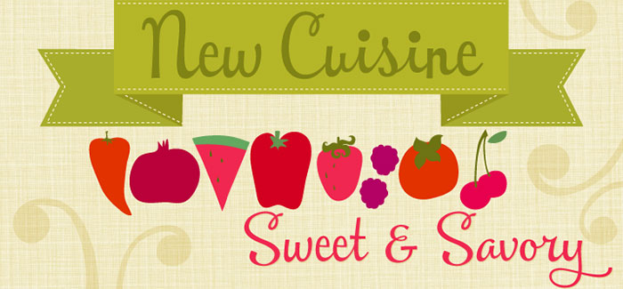
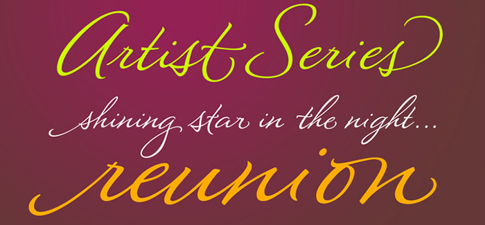
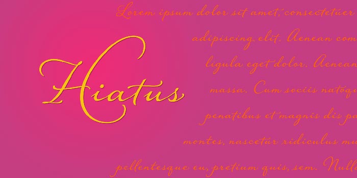
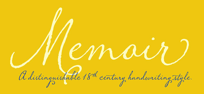
SR: That’s usually the one I’m working on. I can’t say I have a real favorite but I have some that are certainly more successful. Hiatus is probably the best connecting script I’ve done in terms of its fluidity, but Memoir, which also connects, has more personality so to speak. What is more important from my perspective is which ones get used the best. I always love seeing samples of my fonts in the context of their use.
CBdO: Do you think having the ability to hand letter is a necessity for making type today?
SR: Years ago I would probably have said yes without hesitation. Today I realize many young designers are as comfortable working on screen as you or I might be sketching or writing on paper. That being said, I would say if you are trying to create fonts that replicate work done by hand a far better approach is simply to do it by hand. I also agree with Doyald Young that it’s actually much faster to work out an idea on paper than it is to render that same concept on the computer.
CBdO: What are your tools of choice for producing lettering?
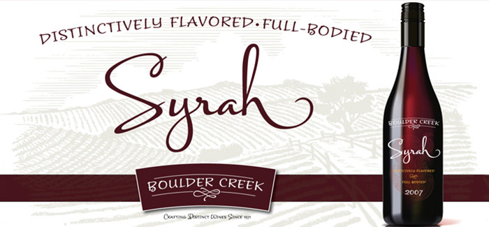
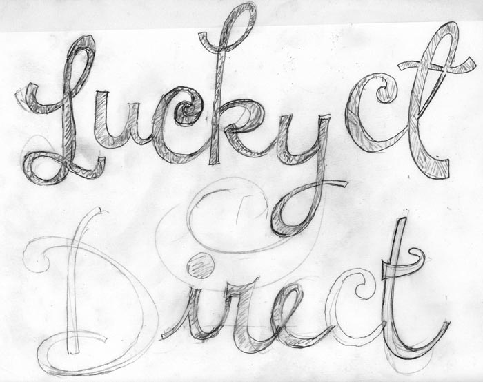
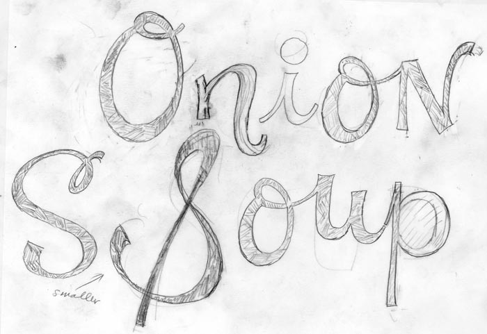
SR: For more calligraphic and script styles I gravitate mostly towards the pointed brush. I love how expressive it is. For 10 year at American Greetings I was doing pointed brush lettering a lot using a Scharff Fine Line sable brush. The lettering behind Montague Script was done in this fashion. I worked on smooth vellum in a specific style and got pretty good at it. Recently, when I decided to start teaching, I completely started over with pointed brush and began working in a more spontaneous expressive way. It still involves discipline and training, but with less restrictions. I like to draw lettering as well so regular pen and pencil with a sketchpad is great. I always pictured myself having loads of filled sketchbooks, but that’s not my reality. Some of my most interesting sketches are on whatever waste paper or junk mail I have in front of my computer at night while watching Netflix.
CBdO: Do you miss being a full time lettering artist at American Greetings or are you enjoying working for yourself?
SR: Although I enjoyed having tons of lettering projects to do, I much prefer working outside the cubicle farm. I still visit there every so often and meet with the team to discuss fonts and whatever else is relevant. They treat me as a team member even though technically I’m a contract worker, which makes it all that much better.
CBdO: Besides lettering and making fonts what else do you do that is creative?
SR: Although the lettering arts are both an occupation and a passion, I do have other interests. One thing I’ve done even longer than lettering is playing music. I’ve played various types of music and instruments for most of my life. I’m particularly fond of traditional music like Appalachian and Irish fiddle tunes. I’ve been playing a traditional Irish style wooden flute for about 25 years. Learning to play music seems to go well with other creative arts; not necessarily in any choreographed ways, but perhaps by a combination of mental and physical coordination not to mention the sense of confidence you develop.
CBdO: I know that you have been teaching a lot lately. Do you plan on teaching more for 2014? Also… is there any chance of a future book on designing fonts?
SR: I have a few workshops in the works, but have room for more in the coming year. When I prepare to teach something I go through tons possible exercises to use in the class, analyze what I’m doing, and inevitably learn more on the subject than I did before. I keep a scrapbook of my own studies through this process both as a reminder and a reference.
As to a book, that was a pipe dream for a while and I have had people suggest it. The last time I was seriously thinking about it I got an email from Alec Julien for a book on font making that he was putting together. He interviewed myself and a few other type designers. Given my current schedule I think a book would have to be much further down the road.
CBdO: Do you believe that every font matters?
SR: Certainly. Although I prefer quality typefaces, sometimes even a poorly designed font in the right place can be very effective. Typography Rules!
Stephen Rapp Interview by Charles Borges de Oliveira for Fontmatters, ©2013
Stephen Rapp on Behance, MyFonts


New Fonts
Bolyar Sans Pro font family
May 20, 2019 | fontmatters
Download Bolyar Sans Pro font
This is Bolyar Sans Pro font family. It took more than 1 year hard work to transform the existing Bolyar Pro from Serif to Sans Serif version. The result really surprised even us from The … Read More
Attractive font by lettersoup
February 4, 2019 | fontmatters
Buy Attractive font family
Attractive type system comes in 104 styles and 4 widths with extended coverage of the Latin-, Greek- and Cyrillic Script. The design origins of Attractive are in early-20th centuries technical style aesthetics, but they are combined … Read More
DIN Neue Roman typeface
April 6, 2018 | fontmatters
Download DIN Neue Roman typeface
DIN Neue Roman typeface adds something new to the technical origin of the typeface DIN 1451. The sanserif classic gets a serif counterpart that breaks with convention while preserving its readability. The industrial impression of … Read More
Submit a Comment