
Debi Sementelli Interview

Debi Sementelli interview – letters of tenderness, love and beauty
A dozen questions might come to your mind when you read this interview with Debi Sementelli (Lettering Art Studio). Ever wondered who designs wedding invitations, beautiful hand-made greeting card etc? What kind of person is this – a natural talent or a well-trained artist? Or maybe both… How is it all done – is It hand-written or created with digital fonts? So many questions and only one answer to all of them – this is about a woman who is in love with letters – a caring mother, wife and artist at the same time – meet the amazing Debi Sementelli in an interview conducted by the great master of pen – Mr. Stephen Rapp.
Stephen Rapp: I know that you returned to your love of calligraphy several years ago and have since expanded into type design. Can you share a bit about your journey in and out of the lettering arts?
Debi Sementelli: Before I had my children, I was working for myself doing freelance lettering and signage. My primary tools were pointed and flat brushes and broad edge pens. In addition to traditional wedding work, I did signs and props for several local event planners as well as posters for a variety of hotels. I also had the opportunity to design a Christmas card for Neiman Marcus and used to be the calligrapher for their special Fortnight events. So there was a lot of variety in the projects I got to work on, which was a lot of fun.

Una Bella Vita – Debi Sementelli
After I had my second son, I quit working and became a stay at home mom. I mention this because I see young moms facing the same dilemma now. I certainly know many women that successfully managed to work outside of the house full time while being a mom. I just recognized my own personal limitations and decided what was best for me and my family.
So fast forward to my youngest son Alex turning 17 and being able to drive himself to school, soccer practice, friend’s houses, the mall, etc. I realized it was time for me to go back to my first love, lettering.
That was in 2005. I started to get my name out there, and picked up lots of wedding work. But times had changed in the 20 years I was gone. Everything was digital! So I bucked up and took Photoshop and Illustrator classes at a local community college. It took awhile but eventually I got the hang of the basics. At that time I also started teaching an “Intro to Calligraphy” workshop for the PaperSource store that had just opened in Dallas. That’s when I became familiar with the work of Crystal Kluge who was doing stamps and other lettering for them. I saw that she had created her Nelly Script font and became intrigued with the idea of creating one myself but had no clue how to go about it. I was also hearing from my bride clients that they loved calligraphy but their budgets didn’t always allow for as much of it as they’d like. So it made sense that if I could make a font, it would serve some of my clients well.

Please Enjoy sign – Page Stationery
Serendipitously, I saw the interviews with Stuart Sandler (who digitizes Crystal’s fonts) as well as Laura Worthington (Now a friend and my personal hero). She had been a graphic designer and lettering artist before becoming a font designer. I reached out to both of them via e-mail asking their advice and thoughts about anyone that I could partner up with. Without realizing it, they both suggested font designer, Brian Bonislawsky. So I contacted Brian, who told me he had been looking at my work online. We chatted and soon decided to work together. In 2011 our Correspondence Ink Type Foundry released “Belluccia“, which ended up making MyFonts Most Popular Fonts for 2011. With that warm reception, I felt encouraged to continue to produce a second font with Brian, “Dom Loves Mary”. When it did well, I thought “maybe I’m getting the hang of this”, so I decided to try to start my own Debi Sementelli Type Foundry releasing “Cantoni” in 2013. It also did very well. And Brian and I just recently released Belluccia Bold which is currently on the Hot New Fonts list. So now, there’s no stopping me. (laughing)
I am a huge admirer of font designers who, like me, started out as lettering artists. Laura Worthington, Stephen Rapp, and Charles Borges de Oliveira have all played a part in helping me become a font designer. Their work is incredible. With every font, I strive to get to that level.
Stephen Rapp: Your calligraphy work has been quite popular for events like weddings. I see that in your type designs as well. Tell us a bit about the thought process you put into making fonts to cater to both event planners and DIY designers.
Debi Sementelli: The wedding market is really my base and I’ve always loved planning parties myself. So I’m always trying to think of the end products that are used for weddings and events. And because I have so many friends with sons or daughters getting married, I know the expense that a wedding can be. I also know that sometimes, to save on costs, the Mother of the Bride is creating some of the wedding items herself. So in addition to the designers who are computer savvy, I’m also thinking about that mom who works in Microsoft Word. How can I help her easily create Table Numbers or “Day of” signage? I want people of all skill levels to be able to feel comfortable using my fonts to some degree or another. So that plays into the process.

Quill Letterpress Invitation Suite – Aerialist Press

Stephen Rapp: Script fonts are generally a reflection of both a style of hand work and the tool used to create the lettering. You have developed a particularly lovely set of styles based on pointed pen calligraphy. Can you share a bit about that tool and its use.
Debi Sementelli: Thanks you! Oddly enough, I actually started pointed pen when I returned to lettering after 20 years. When I was working previously, Italic was a very popular hand. Besides that I used brushes. Pointed brush was somewhat of a specialty for me. In fact my Cantoni font is based on a upright style of brush lettering I created long ago. Because the basic pressure and release is the same with pointed pen, I took to it pretty easily. Along with discovering the tool, I also found the variety of nibs the are available. Each one gives a slightly different effect. That’s one of the things I love about calligraphy and lettering in general. The same tool in another person’s hand creates a totally different look. That allows me to infuse my own personality into a lettering style which eventually becomes a font.

Stephen Rapp: As a follow up to that last question, are there other calligraphy tools that you are considering as a base for a font design?
Debi Sementelli: I have a wide variety of different types of pens and brushes, even sticks that I play with. Each gives you a different way to express something. I like to play with brush markers. The quality of some of them is really quite good. The effects you can create with Ruling Pens are fascinating to me. So far, I’ve only used pointed pen to create my fonts, but I hope to experiment with other tools and see how well they translate into fonts.

Stephen Rapp: Where do you find inspiration for your work?
Debi Sementelli: It usually comes from just playing with my pens and brushes. It’s a similar process to working with a client. They start describing the look and feel they want and I start to get a picture in my head of what that might possibly look like. When I’m designing a font I’ll think of a feeling I want to create… lively, fun, letters that dance, classic and elegant, light and airy or traditional with a touch of whimsy. Then I get pictures in my head and try to I just start writing words with the look that evokes that feeling for me. The more I follow that feeling, the more the letters start to flow until they all have a look that is uniform.
Sometimes, while working on an envelope project, I may be asked to create a lettering style that works with the invitation design. I’ll come up with a basic set of letters that reflect the feel of the invitation, then as I’m addressing the envelopes I experiment more with different alternate letters. Of course I’m always looking at letters that I see every day, whether on a sign, on the internet or in print. So that also feeds into the file of images that I take in.
Stephen Rapp: There are a lot of young designers these days discovering lettering and typography. Do you have any words of advice to help them along their way?
Debi Sementelli: First, understand that lettering is an art. Good lettering doesn’t happen because you take one class. It requires practice. When I taught the “Intro to Calligraphy” workshop, I didn’t have attendees use pen and ink. We only worked with broad edge and brush markers. I did this because I wanted people to work on the most important components of good lettering: the strokes, the angle, letter consistency and the pressure and release of the pointed brush or pen. Using pen and ink brings more factors to think about. I know using a marker doesn’t feel as “official” as working with pen and ink, but if you are serious about becoming a good calligrapher, you need to put first things first. Patience will pay off. So with lots of practice with markers, the strokes become ingrained in your muscle. (Literally it’s the memory in the muscle theory.) That frees you up to manage ink flow and pressure on the metal pen nib when you do transition.
As for typography, I’m pretty new to typography myself. So the best advice I can give is to look at the work of really good people. Read what you can about what makes type design good. Don’t copy someone else’s style. Come up with your own, whether you generate it on the computer or by hand. Think about who you are designing for. Who would use your font and for what? I think when you keep the end in mind, you can make better choices about what should or should not go into your font. Go to TypeCon or other gatherings where Type is the focus. Connect with people in the Type world. I’ve found them to be a very friendly group. And don’t be afraid to start, no matter what level you’re at. If it’s your passion, pursue it.
Stephen Rapp: Although you now live in Texas, you come from Italian heritage and recently traveled to Italy. Does Italian culture influence your work in any way?
Debi Sementelli: Being Italian is a big part of who I am so I know that it plays a part in what I create. When I was in art school, my life drawing teacher told me I had a “Roman” hand. My figure drawings tended to be very classical while other students were more modern. There have been many artists in family. My mother was a naturally gifted artist and had perfect penmanship. Watching her doodle the alphabet while she was talking on the phone is a distinct memory that started my love of letters as an art form. My uncle was a commercial artist for the army. He passed a lot of his brushes and tools down to me. And one of my Italian relatives was a painter. My current cousin in Rome has a daughter who is studying graphic design. In fact she made a font for one of her recent class projects!
I had been to Italy a long time ago, and felt a connection to the people and the city of Rome. On this visit, we not only traveled to Rome but Florence and Venice as well. In Rome I had the pleasure of spending time with some of my cousins and their families as well as some of my husbands International work team. I felt an instant connection with all of them. As we waked in the neighborhoods near their homes and in all of the cities we visited, the connection kept growing. It’s as if the connection was being made with something similar that was already inside of me. Now I’ve started learning how to speak the language so I can continue to deepen that connection and understanding of the culture. When you feel something that strongly it can’t help but be a part of what you do.

Stephen Rapp: Having your own type foundry is different than basic freelance work. How would you describe a typical work week in terms of time spent on various activities like lettering, digital production, and business activities?
Debi Sementelli: Oh that’s always hard to measure, because when you work for yourself you wear so many different hats. I strive to make every day as balanced as possible. When you work out of your home, it’s easy to work 24/7. I have a blog (which means creating content and taking pics for the blog) and I try to stay connected on Twitter, Facebook, Pinterest and Instagram. Answering e-mails is also part of my daily schedule. I probably spend about 1 hour- 2 hours a day on various social media and answering e-mail.
With all that in mind, I try to create my day so I get time to exercise, spend time with my husband Michael, work on my Italian lessons, connect with friends and family and take time to be thankful and get some good work in. I’m really happiest when I am living in balance. That being said, that means not everything happens each day.

Perla Gold Foil Invitation Suite – Aerialist Press
One thing I’ve learned is that I have to treat my Type Foundry like a client and block out time to work on font creation. That took some getting used to because that means a lot of the time I have to say no to outside work.
Luckily I’ve found some very talented lettering artists to refer clients to. That makes it easier. Assuming I don’t have an outside project to work on, I would say I am pretty much nose to the grindstone much of the time. So that could mean 8-12 hours a day. If I’m in the beginning stages of designing the look and feel of the font, that means I’m at my light table with pen and ink lettering page after page until I start to get the consistent look I want. Once the letters are completed, they’re scanned in and cleaned up in Photoshop then transferred to FontLab where I start the drawing process. I usually make myself get up every hour to move, go get something to eat or check in with Social Media. If I can, I try to post 2- 3 x per week which can take up to 3-4 hours per post. Now that my husband has retired from IBM, he’s been able to join me. He helps with blogging and paperwork which takes some of the work off of me. There are definitely times when I am trying to get a font out, that I will work 7 days a week. Although my husband is good about dragging me out to a movie. (laughing) But I balance that out when I’m not in font mode by taking time off to visit with family and friends. I truly love the process of creating a font so it doesn’t really feel like work. But I think it’s important to have a balance.
Stephen Rapp: Cantoni is a much more whimsical style of script than either Belluccia or Dom Loves Mary. This was hugely successful and clearly shows a change in tastes within the wedding and events market. You have a great deal of experience in that field. Can you tell us a bit about current trends in wedding invitation fonts and how you came to design Cantoni?
Debi Sementelli: Weddings are much more personal than they used to be. The choice of style and color is truly personalized to the couple. There’s also the love of all things handmade. So hand lettered fonts just naturally fall in line with that personalized look. And brides definitely like a more modern look in terms of calligraphy. So we’re seeing a lot of fonts that are more like casual hand writing. Text fonts that are hand lettered or have that rough, non uniform feel are also widely used.
As I mentioned previously, Cantoni is the pointed pen version of a brush lettering style I developed a long time ago. When I saw that the trend in weddings was leaning toward casual scripts that would work well for the outside rustic wedding, I thought this style would be a good fit. It’s really the font that I identify most with. Belluccia and Dom Loves Mary were created more deliberately with the end user in mind. With Cantoni, I had already developed the lettering style. It was more a matter of extending it to include more alternates that could add some fun and whimsy. And that goes along more with my personality. It just happened to work with the current trend. I’m working on a new font that also comes from a hand lettered style that I previously developed. It’s been fun to freshen it up and add some more things to it. It might be out in 3-4 months. We’ll see how it progresses.

Stephen Rapp: Having done both calligraphy work and type design, do you plan to do both in the future or possibly specialize in designing beautiful script faces?
Debi Sementelli: I’m a party girl at heart and I’m Italian! I love to celebrate life and share in all the wonderful events that gather families and friends together and hold special meaning.
So I’ll continue to do some hand lettering work but it will be limited to my current clients and the time I have available when I’m not in font mode. Having said that, of course this year would be the year that 3 friends daughters are getting married. (laughing)
So I am helping all of them with wedding items. But I have committed myself to allowing more time to spend on fonts. I’ve set a goal for myself this year. I’ll let you know in December if it’s been met. (laughing)
I love the synergy that comes from designing type. When I see how someone has used my font, (and by the way that is the greatest thrill) it makes me feel like they are taking it to a new level. They may have used it in a way I didn’t think about, or chosen a particular selection of letters that is just perfect for the project. I feel very connected to and a part of that, which is really cool for me. When I create something in calligraphy, it’s a different feeling. There’s the connection with the client and what they want to achieve. But once it leaves the studio you don’t necessarily know what happens to it. Discovering my font on the internet , in a magazine or on a product is such a delight.
Stephen Rapp: Do you believe that every font matters?
Debi Sementelli: Yes! When I talk to the average person about what I do, they start to look for fonts and become much more aware of letters that are everywhere around us. Fonts give us a means to communicate in ways that are often subliminal. A wisely chosen font can evoke a wide range of emotions. Fonts provide a visual taste of a thought or feeling. A designer uses that to bring emotion to the event or product their creating. In today’s world, we need as many ways to connect with each other as possible. Well designed fonts play a huge part in those transactions.
Debi Sementelli on Facebook, Twitter, Instagram, Pinterest, MyFonts,Lettering Art Studio
Debi Sementelli Interview by Stephen Rapp for Fontmatters, ©2014
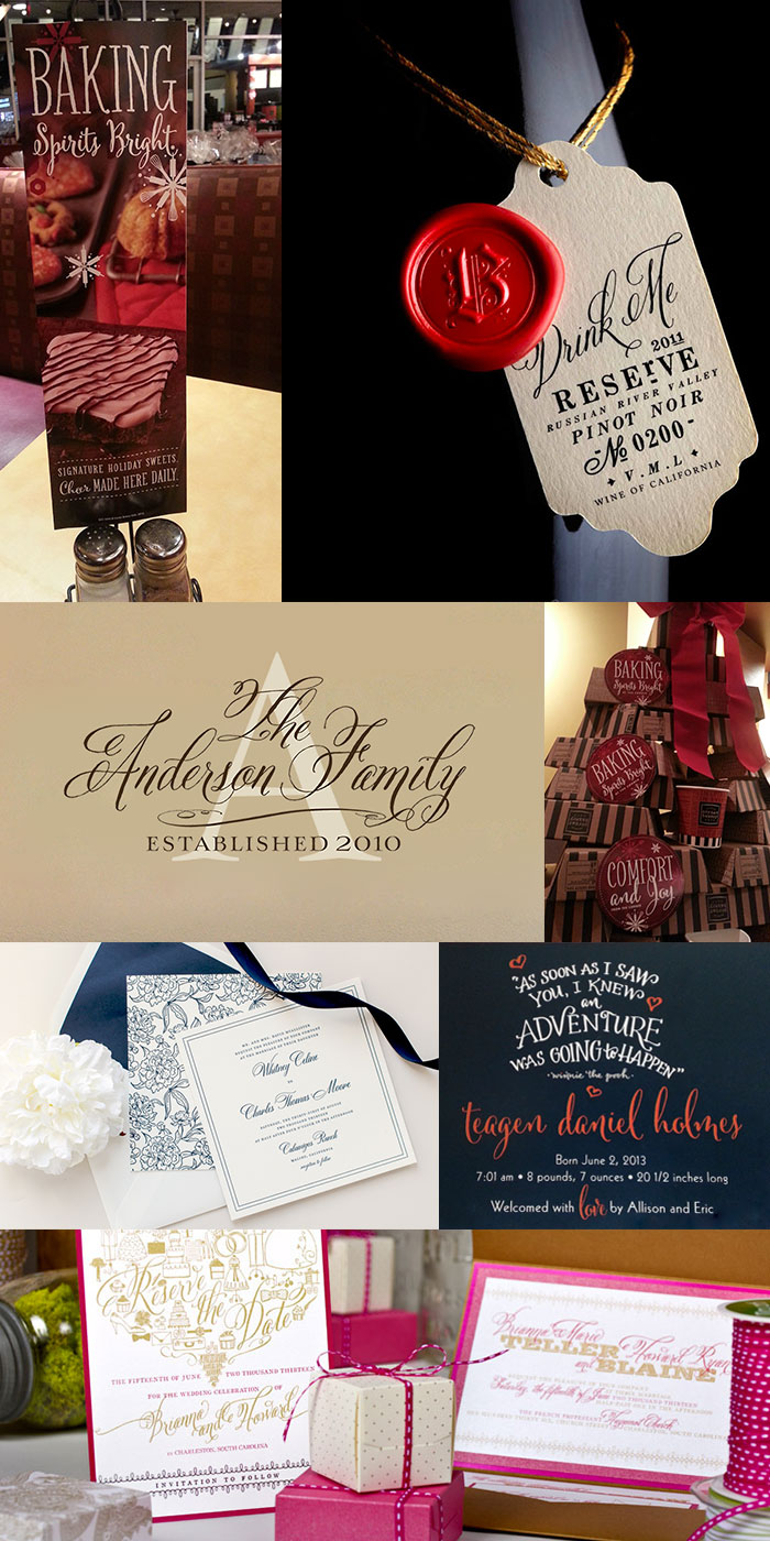
Baking Spirits Bright – Corner Bakery
Drink Me tag – Stranger & Stranger
Vinyl Wall Decal – Old Barn Rescue Company
Posh Letterpress Invitation – Kimberly Fitzsimons
Baby Announcement – Debi Sementelli
Reserve the Date Invitation – Envelopements


New Fonts
Bolyar Sans Pro font family
May 20, 2019 | fontmatters
Download Bolyar Sans Pro font
This is Bolyar Sans Pro font family. It took more than 1 year hard work to transform the existing Bolyar Pro from Serif to Sans Serif version. The result really surprised even us from The … Read More
Attractive font by lettersoup
February 4, 2019 | fontmatters
Buy Attractive font family
Attractive type system comes in 104 styles and 4 widths with extended coverage of the Latin-, Greek- and Cyrillic Script. The design origins of Attractive are in early-20th centuries technical style aesthetics, but they are combined … Read More
DIN Neue Roman typeface
April 6, 2018 | fontmatters
Download DIN Neue Roman typeface
DIN Neue Roman typeface adds something new to the technical origin of the typeface DIN 1451. The sanserif classic gets a serif counterpart that breaks with convention while preserving its readability. The industrial impression of … Read More
Submit a Comment