
Charles Borges de Oliveira interview – part 2


Charles Borges de Oliveira interview – part 2.
After the incredible Interview by Laura, only a few questions left unanswered. We decided to ask them personally to Charlie – here they are in our exclusive interview.
We’ve seen pieces of Desire thru the years in your works but it actually took you nearly five years – is this enough time to design a masterpiece?
Thanks for calling it a masterpiece. I’ve never really thought of it like that. To be honest 5 years is way to long to design a font especially when you have a family to support. But I believed in it. Sometimes you have to do what you feel it right, though I don’t think I will ever spend that much time on a typeface again. I have too many ideas for future fonts that I want to make so I am excited to begin working on those.
Imagine you were an ordinary graphic designer – what would you use Desire font for? Any special recommendations?
Desire was made so that many different “flavors” of lettering could be achieved. I made it so that whatever letters you select you can create different styles. From vintage to modern to elegant.
How would you advise other designers to use Desire in combination with other typefaces?
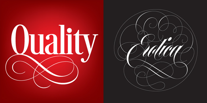
Desire works very well with formal scripts. A couple of good scripts that it would pair well with is Sloop or Erotica.
How did you come up with the idea of creating Desire?
For the last 8 years I always wanted to make a Roman typeface that had lots of alternates. I wanted it to be a designers’ toolbox of letters. So I started on it and it just grew from there.
What (and why not Who) influenced your work on Desire?
Everywhere I go I am constantly looking at letters. I’ve almost gotten into a few car accidents looking at signs. My inspiration for Desire came from the beautiful lettering on romance novels. I was always fascinated by the lettering. That is why when I designed Desire I made it condensed. It had to be able to handle large words in a tight space. I named it Desire because to me it looks like romance novel lettering.
How did your background as sign painter reflected on creating fonts and particularly on creating Desire?
Well, I never truly became a journeyman sign painter but being in the sign business I was exposed to some of the best lettering out there. It’s unfortunate because there were/are so many talented sign painters that never got the recognition they deserved. I was fortunate to have studied with some of them and also to see the work of others. Desire is a little of everything that I have been exposed to in my love of letters.

We strongly believe Desire has more than enough potential to become an award winning font – do you have own forecast about it?
Thanks! No forecast here but I really hope people enjoy it.
What is your own approach to creating a digital typeface?
90% of the time I start by lettering on paper first. I prefer to do it that way as opposed to being 100% digital. Some fonts I have made have been all digital (Showcard Rodeo and Gloria, though I always draw the S’s by hand on paper first because it is easier for me to do that than trying to use the pen tool in Illustrator/Fontlab. Once I have my letters the way I want I scan them in Illustrator and begin redrawing them. Then I take it into Fontlab and start doing more cleanup and fixing them so they work as a typeface.

What is first in your work and maybe in your life – lettering or typeface design? Does your lettering practice influence your typeface design till the moment you have clear idea of new typeface style?
It’s always lettering first for me. I feel having a strong foundation of lettering actually goes hand in hand with typeface design.
What makes you happy in your life and how does it reflect on your letterforms?
People that truly know me know that I am always happy. I just love to laugh. I think it shows in my fonts. They always look happy, especially my scripts. But the things in my life that make me happy are my family, friends and our 4 cats. Oh and beautiful letters.
Work and Family – how do you keep your balance?
Well, that has been a tough area for me lately. I’ve been working on Desire straight for the last 40 days so I have not had much of a chance to spend time with my family. But now that I am wrapping up having Desire done I plan on making up for lost time with them.
Your teamwork with Pierre Tardif on Aloha typeface was very successful – do you plan to continue working with other artists on future projects?
I do. But I truly enjoy just making my own fonts. It is easier for me. Though me and Ale Paul have talked about designing a typeface together. Someday I would love to make one with him. I also have a good buddy, Brian Grant that has an extraordinary typeface that I am really excited about.

What should we expect next in your repertoire?
I am planning on making a rustic version of Desire as well as a spurred version. I did a piece of script lettering for American Greetings a while back that I would love to make into a font. Also I am planning on a black letter typeface as well.
Do you believe that every font matters?
Yes, of course! Fonts are the backbone of a good design. If chosen properly they can make or break a design.
Charles Borges de Oliveira Interview
Fontmatters, ©2013


New Fonts
Bolyar Sans Pro font family
May 20, 2019 | fontmatters
Download Bolyar Sans Pro font
This is Bolyar Sans Pro font family. It took more than 1 year hard work to transform the existing Bolyar Pro from Serif to Sans Serif version. The result really surprised even us from The … Read More
Attractive font by lettersoup
February 4, 2019 | fontmatters
Buy Attractive font family
Attractive type system comes in 104 styles and 4 widths with extended coverage of the Latin-, Greek- and Cyrillic Script. The design origins of Attractive are in early-20th centuries technical style aesthetics, but they are combined … Read More
DIN Neue Roman typeface
April 6, 2018 | fontmatters
Download DIN Neue Roman typeface
DIN Neue Roman typeface adds something new to the technical origin of the typeface DIN 1451. The sanserif classic gets a serif counterpart that breaks with convention while preserving its readability. The industrial impression of … Read More
Submit a Comment