
The modern face of Bulgarian Typography and Cyrillic typeface design

Vassil Kateliev – The modern face of Bulgarian Typography and Cyrillic typeface design
Science. Knowledge. Talent. These are the words that describe our next interviewed star best. His personality is an integrity of those 3 words and his talent is flourishing in almost every aspect we meet in our lives. We cannot say everything about such complex individual so we decided to focus on what he loves most and does best – Typography. Founder of Karandash type foundry he is one of the leading type designers in Bulgaria and probably one of the most significant figures in modern Cyrillic Typography across the world. We decided to interview exactly him right at the eve of 24th of May (Slavonic Literature and Culture Day) because of his devotion and exclusive attention to type design in the aspects of Cyrillic letters. A unique person, a bright individual, an amazing type designer – meet Vassil Kateliev!
Vassil, our first question seems to be always the same – How did you get into typeface design?
I have always been mysteriously attracted to type, even as a little child, but I have entered the domain of type design by pure curiosity and also necessity. Out of curiosity I have created my first three typefaces on a computer at the age of 16. They all were inspired by covers of books lying around my parents’ home. As you can imagine, it was an enormous task for teenager with absolutely no education in arts, design and typography having to reinvent all the rules, patterns and quirks of type design, just to recreate the whole alphabets – Latin and Cyrillic – from the limited set of characters found on the covers, but the whole experience left me with the confidence that everything is possible, even creating my own fonts. Twelve years later I was a young graphic designer that was gaining popularity, so out of necessity – I started making Cyrillic character sets for typefaces that I wanted to work with. It felt good and when I felt confident enough to make something of my own, I started working on fat cursive antiqua, later called Callista, that became an instant success. A bit prior to that moment, I’ve met Jordan Jelev,a famous Bulgarian wine label designer and calligrapher, who showed me his works and expressed an interest that we do something together – so we did Bolyar and without knowing we started a supper successful mega family and a beautiful friendship. In the following three years I worked on various type projects in my spare time and then the breaking point came – I was not interested anymore in taking graphic design jobs, just wanted to do typefaces and that was exactly what I did in 2013. Then in 2014 my first text typeface Basil received a special mention on Cyrillic category in 7th International Type Design Competition for non-Latin typefaces – Granshan. This was of huge importance for me, because this was the first ever typeface with Bulgarian Cyrillic to be recognized in major type design competition. In the mean time I began teaching Type and Typography at the local university and started writing a doctorate on type design technology. So it seems I have finally found my calling (for now) and if I could immodestly say not that bad for a self-taught type designer. I love type design because it is multidisciplinary – it incorporates as much artistry, craftsmanship and understanding of aesthetics as well as engineering, mathematics and programing. It presents so many possibilities and there is so much that can be done (not only design typefaces) or be improved that I intend to stay in the field as long as possible – I’ve only just begun.

Callista – Vassil Kateliev’s first successful typeface
Which is the most significant typeface on your path as a type designer – what are your favorite ones and what inspires you in them?
Oh, they are so many now – the typefaces and the designers. Like any other font designer I am also obsessed with type, so it is really hard to say or rather it will be too long to explain. I will only mention my first true love and long lasting inspiration – Milka Peykova. She is a Bulgarian artist, book and type designer that was very active in the 1970s and 1980s with rather avant-garde and decorative works. When I was a little child my father used to show me her works that were printed in the polish magazine Project. They made such a profound mark in my live that inspired me to enter the domain of type design years later. Callista and Gaytan as well, as some other unpublished projects of mine, were directly inspired by her works. If I could,… I would actually thank all the great Bulgarian artists and type designers – Boris Angelushev, Vasil Ionchev, Todor Vardjiev, Kiril Gogov… (they are so many) – for their wonderful and dedicated work that resulted the Bulgarian Cyrillic – they inspired me like so many others through the years. Despite the gap of generations, they planted the seeds that seem to start flourishing now – take a look at the current generation of type designers in Bulgaria – how many they are and how able.

Left: Original /zhe from Milka Peykova and Right: /Zhe from Gaytan
I also prefer not to have one favorite designer or particular typeface(s), especially from the “classics”…, but to find daily inspiration by the works of my contemporaries and praise them accordingly: Oksana Series by Andrij Shevchenko is one of my favorite; Amanita by Krista Radoeva is a visual feast; Willam by Maria Doreuli is the most beautiful thing I have seen in years; Kazimir by Ilya Ruderman and Yury Ostromentsky is fresh, bold and punchy as a slap in your face; the geometric sans serifs of Gayaneh Bagdasaryan are uncompromising good; Weitalic by Wilhelm Eckert has impressed me much with its intriguing style; Tupper, Corpo and Zigfird by Mateusz Machalski are also full of attitude and I love that; Centrale Sans (and the coming pro) by Alexander Nedelev and Veronika Slavova are just plain wonderful; the works of Botio Nikoltchev, Ani Petrova, Nikola Kostić, Veronika Burian and José Scaglione… the list could grow exponentially so I stop here.
Do you start your projects on paper making sketches of letters and glyphs, or you do everything on your computer?
I work entirely digital and I do everything from sketching through prototyping on computer – this is the fastest and most reliable way that works for me. Personally, I love the constraints of digital type design and the challenges that derive from them. To make something beautiful and meaningful in 1000 units per em design space, using reduced number of points bound to specific rules, is a challenging task that requires you to be clever and inventive. I tend to think about designing type as a giant jigsaw puzzle, full of logical conundrums and strategy.
You do something still rare as a type designer – Cyrillic typefaces. Many of your colleagues say this is a big hassle. What are your feelings about Cyrillic letters?
Making Cyrillic and my obsessive love of it, is the sole reason I do type. Yep, it’s true,… so you won’t see me making a Latin only typeface any time soon. Few people actually know that at the beginning of my design process, I prototype the Cyrillic character set first. I use it to set the constrains and overall tone of the project – for example if particular construction style of /K/k (Ka) won’t yield a nice /Ж/ж (Zhe) it is dropped in favor of one that will and that one will later be used for both writing systems. Then I begin developing Cyrillic and Latin in parallel – such a measure gives me complete confidence that they will be visually coherent and in harmony in later design stages. Actually all my typefaces are conceived in manner that suggests Latin and Cyrillic to be used side by side in bilingual applications.

Cyrillic characters from Sybilla Pro. and The lowercase italic /zhe that I have invented
What are the most common problems with Cyrillic and how do you solve them?
If you ask the same question to every type designer that does Cyrillic you will get, all sorts of wildly varying answers from “there aren’t any…”, to “…oh there are so many”. Every writing system has it quirks and oddities, so my personal position is somewhere in between and slightly leaning towards the first statement. I really don’t feel the need to discuss the difficulties of constructing/writing /Я (Ya), or how to balance Bulgarian Cyrillic lowercase /з (ze), and so on… it is all solvable in one way or another, in some type designs more easily than others. I also do think that in terms of font production, besides the “oddities” of drawing Cyrillic, it is more easily spaced and kerned than Latin, so I guess you could call it a tradeoff.
What is the future of Cyrillic fonts for you and what are the modern trends about Cyrillic alphabet?
With the rise of OpenType in recent years, I’m very happy to observe an increased interest by type designers in developing localized forms of Cyrillic for their typefaces – Russian, Bulgarian, Ukrainian, Belarusian and Serbian. So call it a trend if you will, but paying more attention to the local needs of Eastern European users is definitely a step in the right direction. This is a really elegant solution of the years-old-dispute, which form of Cyrillic is the “fairest of them all”. Concerning the stylistic trends, I really cannot say what they are, or will be – as you can see from my work I’m not that “trendy” person/designer, I just work on whatever I find interesting at the moment.
There has always been an invisible fight between Bulgarian and Russian Cyrillic – what are the main differences between those two styles and which one do you prefer?
It is a much discussed and intricate subject lately. I will try to answer your question, by answering your pervious one… and will cleverly avoid explaining of all the technical differences between Russian and Bulgarian Cyrillic by encouraging the curious reader to check that wonderful collective interview I took part of last year at your site concerning the same subject.
You’ve asked me about the future of Cyrillic: I believe that Cyrillic has to face its second renaissance and evolve in such a way that a true minuscule form of its lowercase is widely recognized and dominating – a lowercase that is delivered from writing tradition not by just scaling down capital letters. The latter practice had its own reasons and may have worked in the past for Peter the Great and his reforms, but doesn’t have to work for us 300 years later. Tradition is a good thing – it keeps us sane, safe and in touch with our past – shows us who we are and where we come from, but we musn’t forget that we are all human and evolution is the most human thing of all. If people change and language evolves, so why a the visual representation of a writing system shouldn’t – Latin script has evolved several times in the past centuries for the better – what about Cyrillic – should we keep it hanging there for the sake of tradition?! Now I guess you could pretty much see where this conversation is going – Yes, I like to think of the Bulgarian form as the future of Cyrillic – would it be recognized as such – only time will tell.
Russian Federation is the largest market of Cyrillic typefaces – what do Russians say about your Cyrillic typefaces? Is this huge market a main target of your sales and in other words – do Russians buy your fonts because of the Cyrillic characters that are included?
Some of my works enjoy a greater popularity than others. I think that has little to do with the style of Cyrillic that I work in. Basil enjoys a wide acclaim in Russia and also its free regular weight is downloaded daily by the dozens from all parts of the country, so I guess the consumers don’t really mind the Bulgarian Cyrillic. Callista and Gaytan were very popular in the past, especially Gaytan which was used frequently for spirits package design, then interest in them declined. The members of Bolyar Family that we developed together with Jordan Jelev (more on the subject a bit later) enjoy an enormous popularity and are widely acclaimed and used in Russia. So I guess it all comes down to the taste of consumers towards a particular typeface style and not so much by the style of Cyrillic used – which I think is a good news.
You have recently released the new updated Sybilla Pro family – tell us some more about it. What are the new features in this expanded pro version?
Sybilla Pro consists of seven weights in three widths with complimentary true italics – 42 fonts in total. This extended type family provides a broader range of advanced typographical features such as small caps, case-sensitive forms, smart fractions, scientific inferiors, super- and subscript figures, ordinals, slashed zero, directional arrows and more. It comes with a complete figure range set of oldstyle and lining figures, each in tabular and proportional widths. Every member of Sybilla Pro has also grown in size – with 900+ glyphs, almost twice as big as the original. Besides the adjoined typographical features I think that the widths are the important novelty – they add the much needed flexibility and versatility in situations where the original struggled. You may have noticed that Sybilla Pro, lacks the ultra-weight(s) found in the original, which in conjunction with the ultra-thin(s) I regard as the crown jewels of the design. They will be released later this year (or beginning of next) as part of a special display package. I am also considering a soft/rounded version of the entire family that may be ready by the end of the year also.
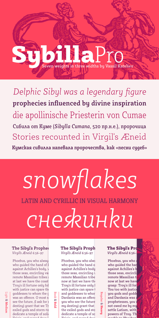
From type designer’s point of view, Sybilla Pro, presented an interesting challenge for me and was a major turning point for my design workflow. I had to write thousands lines of code just to be able to automate my foundry in a way that enabled me to finish the transition from Sybilla (single width/eight weights + italics) to Sybilla Pro (three widths/seven weights + italics) in just under six months. Being able to turn days’ work into minutes left me with very pleasant taste of type design technology, so I became very interested in software as well. Here I should mention that I was into programing as a child so Python and design automation came somehow naturally to me.
Sybilla could be seen in very diverse designs – can you say a few words and even get some advices about its proper use?
Sybilla (Pro) was conceived as text type family, but this doesn’t mean it is not multifunctional. It is ideally suited for all sorts of editorial design and publishing as well as advertising, packaging, logo, branding and even web, e-books and screen design. Sybilla was specially designed with legibility in mind. Its unique, soft and almost cursive shapes help define a warm and friendly slab serif that is easier on the reader’s eye. It has generous internal spaces and is a bit widely spaced, so it is clear and readable even at very small text sizes.
Could we expect that we’d see Basil Pro very soon? We love this family as it is a typographic bridge between classics and modernity and we were very happy to see it awarded with Special Mention at Granshan 2015. What are your future plans about it?
Thank you! I am not quite sure if there will be a Pro version of Basil, as the family is quite feature packed already, but you will definitely see Italics for Basil in the coming year… in one way or another. Besides the obvious choice of developing and adding the so needed Italics to the family, I am currently rethinking my original idea of cursive only standalone family specially designed as Basil’s playful sister. You will have to wait and see which road will I take and I hope you will like the results also.

You have teamed up with Jordan Jelev a few years ago and the result was the Bolyar Pro font family. Many people across the globe are using this family as it is very suitable for many and different types of design, though you officially stated that its initial purpose was wine label designs. Are you going to stop right here or you will continue developing the Bolyar Pro family in different styles, weights etc.?
Bolyar’s initial purpose was indeed wine label design, but with its increasing popularity we saw it in all sorts of reincarnations – from wine and spirits labels trough all sorts of package applications to book covers, awards, games and even as wall murals and interior decoration of a Moscow restaurant. At the beginning there was only Bolyar, but with the addition of Ornate and then with the multi-weight upgrade to Bolyar Pro, we suddenly knew that we were on the right track – developing a luxury mega-family especially targeted at the package design industry. So back then in 2013 (a really long time ago) we had prepared a rather long design roadmap of which the coming members will be (10 so far, Regular and Ornate, being the first two), but we won’t reveal that any time soon – It is a secret. I can only tell you that we recently restarted working again on the project by developing Bolyar Ornate Pro…and that you will definitely see Bolyar Sans in future, ops I shouldn’t have told you that…

Do you believe that every font matters?
Not all, but most do matter :)
Follow Vassil Kateliev on Behance, Facebook, Google+, Twitter, Dribbble, Pinterest, Linkedin.
Vassil Kateliev Interview
The modern face of Bulgarian Typography and Cyrillic typeface design
Fontmatters, ©2016


New Fonts
Bolyar Sans Pro font family
May 20, 2019 | fontmatters
Download Bolyar Sans Pro font
This is Bolyar Sans Pro font family. It took more than 1 year hard work to transform the existing Bolyar Pro from Serif to Sans Serif version. The result really surprised even us from The … Read More
Attractive font by lettersoup
February 4, 2019 | fontmatters
Buy Attractive font family
Attractive type system comes in 104 styles and 4 widths with extended coverage of the Latin-, Greek- and Cyrillic Script. The design origins of Attractive are in early-20th centuries technical style aesthetics, but they are combined … Read More
DIN Neue Roman typeface
April 6, 2018 | fontmatters
Download DIN Neue Roman typeface
DIN Neue Roman typeface adds something new to the technical origin of the typeface DIN 1451. The sanserif classic gets a serif counterpart that breaks with convention while preserving its readability. The industrial impression of … Read More
Submit a Comment